Palladio is a tool that enables you to analyze CSV data using different visualization formats. This page walks you through how to create a network visualization.
How to Use Palladio
- Download the CSV file you want to analyze. We will use the topic Anatomy in this example.
- Click on the "Open Palladio" link in the header box, above.
- Drag and drop the CSV file you downloaded in the text field and click "Load."
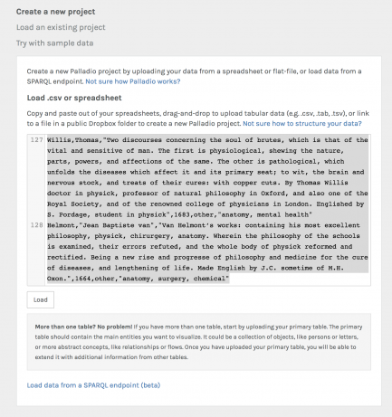
Palladio data loading.
- The "topic" column in the CSV files contains several terms. You can tell Palladio to treat every term individually by clicking on "topic" and, in the dialog that opens, enter a comma in the "Multiple values" field.
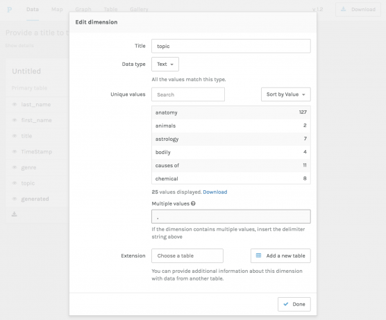
Palladio data edit.
- You can now visualize your data. To create a network, click on "Graph."
- Choose a "Source" by clicking on it. For example, "topic."
- Choose a "Target" by clicking on it. For example, "last_name." This will show you which authors identified by their last names worked on which topics.
- Check "size nodes" and "highlight" to make the visualization a bit more readable.
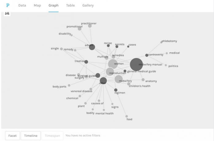
- You should now see a network visualization. What can you read from it?
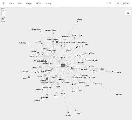
Palladio network visualization.
Additional Tips and Tricks
- Use the Timeline facet to focus on a specific timeframe.
- Use the Facet filter to narrow down the visualization according to other dimensions.
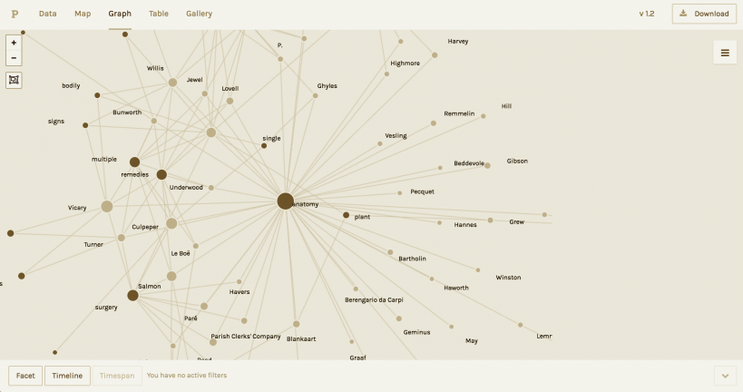
Palladio network visualization.
Example
Contributed by Ella Mints
Through Palladio, I charted the connection between the topic “women” (the modern term we may use) and the genres (designations early modern people would have used) connected to that topic. This graph reveals not only the discrepancies between our categorizations and those of early modern readers, but the breadth of sources encompassed under the simple search term “women.” This visualization indicates, among many other possible findings, that the “midwifery manual” genre corresponds closely with the “women” topic, and that what we would call “children’s health” would likely have been classified under “midwifery manual.” Early modern patients and healers, in short, seem to have approached the intersection between gender and healthcare from a practical standpoint; chief among women’s medical concerns were, unsurprisingly, childbirth and childrearing.
Creating this graph was a fairly straightforward process. After going to “Books by Topic” under “Visualize,” and downloading the “women” CSV file, I followed the REM instructions for creating a graph on Palladio. Checking “size nodes” and “highlight,” as well as manipulating the graph by dragging any of the nodes was particularly helpful when visualizing this data.
